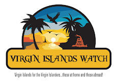
The snake is taken from the Gadsden Flag, and according to Ben Franklin serves this sentiment:
I recollected that her eye excelled in brightness, that of any other animal, and that she has no eye-lids—She may therefore be esteemed an emblem of vigilance.—She never begins an attack, nor, when once engaged, ever surrenders: She is therefore an emblem of magnanimity and true courage.—As if anxious to prevent all pretentions of quarrelling with her, the weapons with which nature has furnished her, she conceals in the roof of her mouth, so that, to those who are unacquainted with her, she appears to be a most defenceless animal; and even when those weapons are shewn and extended for her defence, they appear weak and contemptible; but their wounds however small, are decisive and fatal:—Conscious of this, she never wounds till she has generously given notice, even to her enemy, and cautioned him against the danger of treading on her.—Was I wrong, Sir, in thinking this a strong picture of the temper and conduct of America?Likewise, we Virgin Islanders should picture our temperment: we never wound until we generously give notice, cautioning them of the danger of treading on our homeland and her inhabitants.
We are Virgin Islanders!
And, this snake in the logo let's others know: Do Not Tread On Us! Hiding behind the side of the mountain, the snake says (to me) that the VI seems peacefull, tranquil and welcoming. But, should you tread on us, we are lethal.
Let me hear your thoughts!
Answer the call: Virgin Islands for the Virgin Islanders...those at home and those abroad!


10 comments:
I really like this... especially the snake
Thanks!
Can I be honest? I like the picture, but the font of VI Watch looks like the Wild Wild West...
and maybe the snake could be just a bit more enhanced...just a smidge...
Good suggestions! Thanks! I too agreed with the comment on the font, and I'm trying to find something a bit more fitting. We'll see what is done. Also, I'll see what can be done about enhancing the snake. Thanks for your feedback! Keep it coming, yall!
I agree with everything everyone else has said. One particular thing that stood out for me (and I don't know if you can change this) was the color. The colors don't ring "home" for me... I would like to see a more Ice, Gold, and Green look. It doesn't have to be the entire logo, but it should have those colors somewhere... just my .02. The logo didn't stand out for me...
Thanks for taking the time to comment, Landi. With regards to the color, our thinking was that we would use a scheme that blended with those of the VI Flag. That's why we chose Blue and Gold. Eventhough I went to All Saints, and always battled CAHS in football and baseball, I still am forced to acquiesce to their colors for the sake of the cause! :)
Ok... I can get with that. If that's the case then... I would throw the Eagle up as well... Somewhat like how you have the snake tucked away...
I'm not sure if it actually conveys the true intent of "... those at home and those abroad." I didn't see anything in the logo's image fusing that connection. So, I say, back to the drawing board. We need sun, sand, sea, & an image depicting a universal US landmark. You can do it, I have full confidence in you!
Thanks for the feedback, ya'll. I will try to see if we can get an eagle in there. Or maybe a Chicken Hawk.
I don't know how we can mesh the view from Abroad. My hope is that the logo would produce a nostalgic sentiment in "Virgin Islanders Abroad."
The rattle snake is actually the fundamental American symbol. I'm having them enhance the snake so folk can tell it's a rattler. So, Lybia, I hope I haven't let you down! :)
Post a Comment